Define
Problem
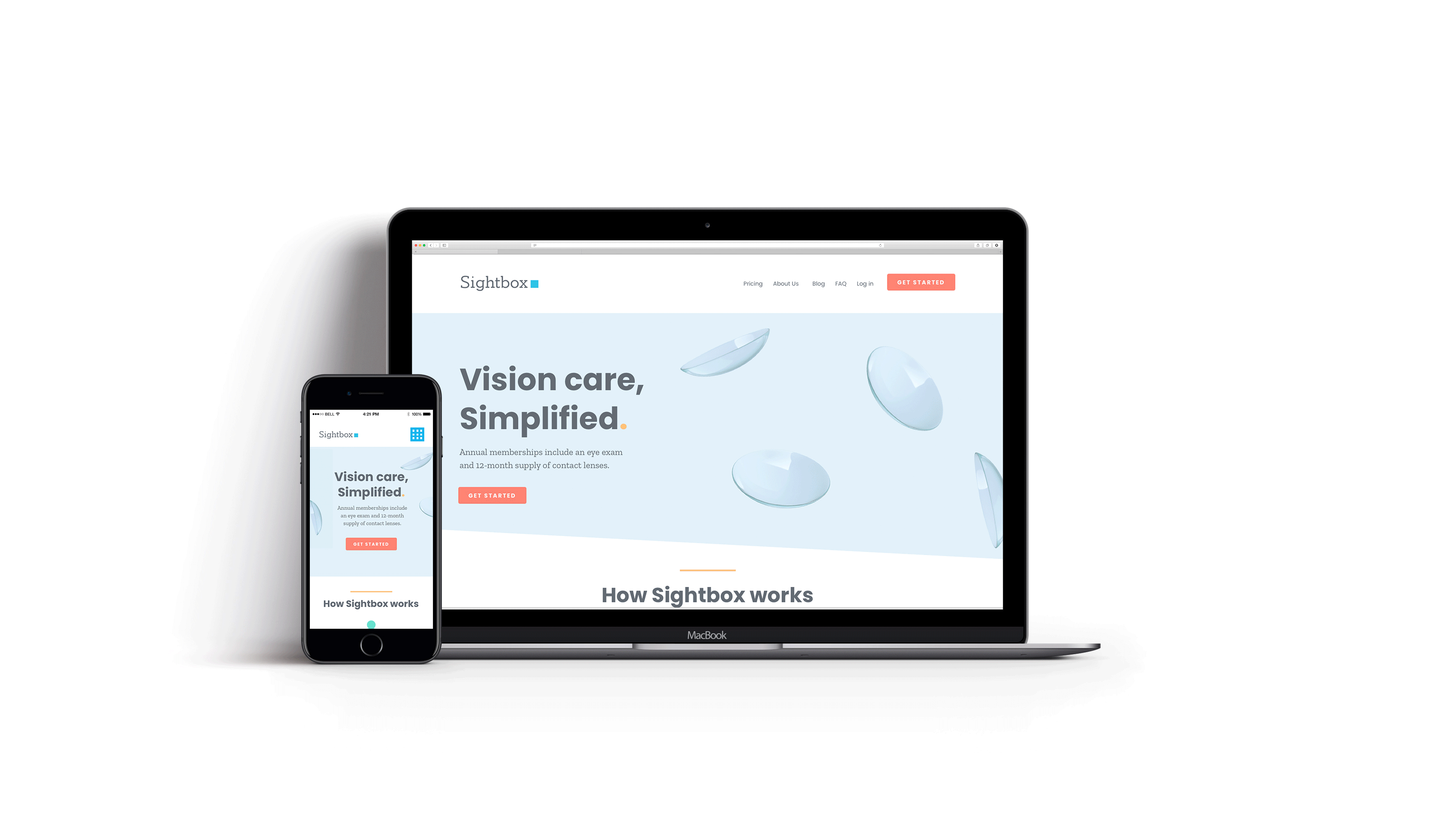
Sightbox's website had a high bounce rate, which in turn affected our conversion rate and business goals.
​
To meet targeted conversion goals, the marketing team wanted research-supported recommendations for decreasing bounce rate and strengthening content relevancy for visitors.
Define
My Role
![2Research.png](https://static.wixstatic.com/media/68f3af_e41c7c701eca4d6e96db7ebb96496804~mv2.png/v1/fill/w_104,h_108,al_c,q_85,usm_0.66_1.00_0.01,enc_avif,quality_auto/2Research.png)
Research and audit the existing content and UX of the Sightbox website.
![2Design.png](https://static.wixstatic.com/media/68f3af_b05886dc96494713a66a04bf5dc1e8bb~mv2.png/v1/fill/w_104,h_108,al_c,q_85,usm_0.66_1.00_0.01,enc_avif,quality_auto/2Design.png)
Design new solutions to solve for research supported problems.
![2Accessibility.png](https://static.wixstatic.com/media/68f3af_b3b9327c30fa475d8da545483f9bb546~mv2.png/v1/fill/w_104,h_108,al_c,q_85,usm_0.66_1.00_0.01,enc_avif,quality_auto/2Accessibility.png)
Ensure WCAG accessibility compliance.
KEY CONTRIBUTORS
Sightbox Marketing Team, Lead Product designer, Engineering team, and a local creative development agency to launch this project.
Process
Define
Discover
Design
Deliver
Discover
Usability
Research
Methodology
Over a period of 2 weeks, we conducted interviews with 9 internal users and project stakeholders to uncover high priority issues.
The design team and I had the users go through the experience of landing on the Sightbox website and asked them to narrate their experience throughout.
Findings
1
Confusion set in around the description of the product offering which was very eye-opening for me.
2
Multiple "how it works" sections (3 different versions) left some users unsure of how long the process would take/what would be required of them.
3
Internal users knew Sightbox offers two plans, but called out we don't highlight that on our homepage, a missed opportunity for dailies users.
4
Majority of users said an entire page of testimonials felt unnecessary, some suggested more info on the pricing/plan description.
![OG_SB_WEBSITE_03 Copy 3.png](https://static.wixstatic.com/media/68f3af_227297a0e558463893b52c38df1319b0~mv2_d_1440_1231_s_2.png/v1/fill/w_394,h_337,al_c,q_85,usm_0.66_1.00_0.01,enc_avif,quality_auto/OG_SB_WEBSITE_03%20Copy%203.png)
1
![OG_SB_WEBSITE_03 Copy 2.png](https://static.wixstatic.com/media/68f3af_19ebd50e7ac540cf9671844c52e247b6~mv2_d_1440_1347_s_2.png/v1/fill/w_396,h_370,al_c,q_85,usm_0.66_1.00_0.01,enc_avif,quality_auto/OG_SB_WEBSITE_03%20Copy%202.png)
2
![OG_SB_WEBSITE_03 Copy 4.png](https://static.wixstatic.com/media/68f3af_919ed69d273040249521b95332a7a713~mv2.png/v1/fill/w_388,h_161,al_c,q_85,usm_0.66_1.00_0.01,enc_avif,quality_auto/OG_SB_WEBSITE_03%20Copy%204.png)
3
![OG_SB_WEBSITE_03 Copy.png](https://static.wixstatic.com/media/68f3af_0084c1f080d4488ea1c25564ae360f18~mv2.png/v1/fill/w_411,h_139,al_c,q_85,usm_0.66_1.00_0.01,enc_avif,quality_auto/OG_SB_WEBSITE_03%20Copy.png)
4
![Simple-contacts-screen-grab.png](https://static.wixstatic.com/media/68f3af_4be7249e280b45c7b9105c8cd7f60c19~mv2_d_1478_5033_s_2.png/v1/fill/w_121,h_411,al_c,q_85,usm_0.66_1.00_0.01,enc_avif,quality_auto/Simple-contacts-screen-grab.png)
![blue-apron-screen-grab.png](https://static.wixstatic.com/media/68f3af_0fbae62bda9f4113a8d932b030308653~mv2_d_1440_4096_s_2.png/v1/fill/w_125,h_356,al_c,q_85,usm_0.66_1.00_0.01,enc_avif,quality_auto/blue-apron-screen-grab.png)
Discover
Competitive
Research
Findings:
We looked at several patterns that are in common use for other subscription-based models because we agreed that familiarity is important for this audience
Discover
Accessibility
Testing
It became an important goal to make sure in the redesign that we revised our color system to pass the standards for WCAG accessibility.
​
I ran our brand color palette being used on the website through accessibility tests on the web and discovered many failures for WCAG compliance.
X
Process
Define
Discover
Design
Deliver
Original site map
Design
Site maps
Starting with user maps helped me understand the website’s current user journey into the sign-up flow. It also helped reveal dead-ends for the user.
With the insight of my lead product designer, I iterated on a revised site map with the inclusion of new content and a journey with fewer dead ends.
![SB_Site-Map_OG.png](https://static.wixstatic.com/media/68f3af_45d8948a2cf14cea87c58a1e817f2f17~mv2.png/v1/crop/x_39,y_0,w_1405,h_830/fill/w_528,h_312,al_c,q_85,usm_0.66_1.00_0.01,enc_avif,quality_auto/SB_Site-Map_OG.png)
New & improved site map
New additions:
-
Relevant content
-
​A more in-depth pricing/ benefits page
-
An about us page
-
The blog (SEO optimized content strategy)
-
-
Access route to the sign-up page from all pages
![SB_Site-Map-NEW.png](https://static.wixstatic.com/media/68f3af_d3fb149ffcfc4fe48a3e8e1a06b73d04~mv2.png/v1/crop/x_54,y_0,w_1390,h_830/fill/w_523,h_312,al_c,q_85,usm_0.66_1.00_0.01,enc_avif,quality_auto/SB_Site-Map-NEW.png)
![WF_01.jpg](https://static.wixstatic.com/media/68f3af_fd0975c769544a188ed7a74f29994c1b~mv2_d_1568_2336_s_2.jpg/v1/crop/x_0,y_0,w_1568,h_2216/fill/w_327,h_462,al_c,q_80,usm_0.66_1.00_0.01,enc_avif,quality_auto/WF_01.jpg)
![WF_02.jpg](https://static.wixstatic.com/media/68f3af_97332292f6e74f5fa54c31f45f6ea0c7~mv2.jpg/v1/crop/x_41,y_14,w_855,h_2116/fill/w_186,h_460,al_c,q_80,usm_0.66_1.00_0.01,enc_avif,quality_auto/WF_02.jpg)
![SB_REDESIGN_HOME_low-fi.png](https://static.wixstatic.com/media/68f3af_b170c6850bb246aeb5c82fc89ba21ffb~mv2_d_1440_4224_s_2.png/v1/fill/w_163,h_478,al_c,q_85,usm_0.66_1.00_0.01,enc_avif,quality_auto/SB_REDESIGN_HOME_low-fi.png)
![SB_REDESIGN_PRICING PAGE_low-fi.png](https://static.wixstatic.com/media/68f3af_aaff193c1cf446ebb8dd8e4e0d5d0144~mv2_d_1440_4274_s_2.png/v1/crop/x_0,y_0,w_1440,h_3861/fill/w_160,h_429,al_c,q_85,usm_0.66_1.00_0.01,enc_avif,quality_auto/SB_REDESIGN_PRICING%20PAGE_low-fi.png)
![SB_REDESIGN_PRICING PAGE_low-fi.png](https://static.wixstatic.com/media/68f3af_d246a7eac8b64498a16fff8e77643b78~mv2_d_1440_3491_s_2.png/v1/crop/x_0,y_0,w_1440,h_3447/fill/w_161,h_385,al_c,q_85,usm_0.66_1.00_0.01,enc_avif,quality_auto/SB_REDESIGN_PRICING%20PAGE_low-fi.png)
Design
Wireframes
Then I moved on to sketches and low-fidelity wireframes of the new site.
Modifying improved modules to our Wordpress site.
​
I used Sketch and Figma to iterate through the design process.
Design
Hi-Fi
Prototypes
The high-fidelity mockups of the newly revised site architecture with relevant content, accessible colors, and revised messaging finally “clicked” for the marketing team’s needs to reduce friction.
​
With the inclusion of visual design, I was able to breathe a little more life into the designs.
![SB_REDESIGN_HOME.png](https://static.wixstatic.com/media/68f3af_943442fca7b047f0a7b299aacd790c93~mv2_d_1440_4224_s_2.png/v1/fill/w_187,h_549,al_c,q_85,usm_0.66_1.00_0.01,enc_avif,quality_auto/SB_REDESIGN_HOME.png)
![SB_REDESIGN_PRICING PAGE.png](https://static.wixstatic.com/media/68f3af_4aa86e4b39bc4c0fb2cc3609d2c83273~mv2_d_1440_4274_s_2.png/v1/fill/w_185,h_550,al_c,q_85,usm_0.66_1.00_0.01,enc_avif,quality_auto/SB_REDESIGN_PRICING%20PAGE.png)
![SB_REDESIGN_ABOUT-US.png](https://static.wixstatic.com/media/68f3af_bfcb1b371e5945d097f18b8a3d34059f~mv2_d_1440_4896_s_2.png/v1/fill/w_187,h_636,al_c,q_85,usm_0.66_1.00_0.01,enc_avif,quality_auto/SB_REDESIGN_ABOUT-US.png)
BONUS TESTING
These mockups were also used in user testing on UsabilityHub to gauge between the two major design options for the “how it works” section. The Vertical story-telling approach won.
X
![SB_REDESIGN_HIW_01.png](https://static.wixstatic.com/media/68f3af_a898c856e9df47bc9659df2cc3718499~mv2.png/v1/fill/w_419,h_262,al_c,q_85,usm_0.66_1.00_0.01,enc_avif,quality_auto/SB_REDESIGN_HIW_01.png)
![SB_REDESIGN_HIW_02.png](https://static.wixstatic.com/media/68f3af_c0995358ea5d48fea539d286acd84478~mv2_d_1440_1288_s_2.png/v1/fill/w_419,h_375,al_c,q_85,usm_0.66_1.00_0.01,enc_avif,quality_auto/SB_REDESIGN_HIW_02.png)
Process
Define
Discover
Design
Deliver
Deliver
Outcome
After the initial site re-design, we saw our traffic from organic searches drive up 25%.
​
We saw Zendesk tickets regarding confused customers decline by 20%.
​
We also saw engagement- the number of interactions, time on each screen- increase.
​
With the company getting shut down, we didn't get to run our test as long as we had hoped therefore minimizing the rate of change.
![Responsive-Gif-Redesign.gif](https://static.wixstatic.com/media/68f3af_ee9cceb020c74ac1add7c7a515790357~mv2_d_3509_2048_s_2.gif/v1/fill/w_875,h_511,al_c,usm_0.66_1.00_0.01,pstr/Responsive-Gif-Redesign_gif.gif)
Deliver
Learnings
![learnings.gif](https://static.wixstatic.com/media/68f3af_af68118cde8d4674a6af70db43ea8690~mv2.gif/v1/fill/w_485,h_410,al_c,usm_0.66_1.00_0.01,pstr/learnings_gif.gif)
Collaboration:
This project was a highly collaborative one, it involved multiple stakeholders. I particularly enjoyed coming together with multiple departments to create the best experience for our customers.
Accessibilty:
I enjoyed advocating for strengthening our accessibility standards, and helping usher Sightbox into compliance.
Areas for improvement:
This project would have benefited from more expansive user testing, if we had more bandwidth to do so I would have liked to conduct more user interviews to get a broader range of input on pain points and also new designs.
​
Proposing tests of new additions rather than complete replacements.