U.S Department of Veterans Affairs
Accredited Representative Portal
Redesigning a federal portal to help accredited representatives navigate the VA claims process on behalf of Veterans.
From north star vision through five stages of iteration to a usability-tested prototype, handed off to engineering for release.

Context
This work emerged from early north star ideation sessions exploring how the Accredited Representative Portal could evolve beyond its initial launch. A key gap in the existing experience was the lack of a centralized way for representatives to search for a specific claimant and confidently take action on their behalf.
The long-term vision was to give representatives a single place to find a claimant, verify their information, confirm power of attorney, submit claims, and eventually track submission history over time.
My work focused on early design exploration for a Claimant Page that could support these needs at launch, while remaining flexible enough to grow as additional data and functionality became available.

North star ideation flow to view a claimant page

Stickies from UX ideation session of content to include on claimant page.
My Role
I was a key designer on the Claimant Page and Submit Forms, and a collaborator on Claimant Search. Working closely with engineering, product, and design partners, I helped define information hierarchy, explore page structure, and align early design decisions with both user needs and technical constraints.
Design Problem
Accredited representatives had no centralized place to find a claimant and confidently act on their behalf. Existing tools like QuickSubmit were fragmented, representatives had to jump between systems to verify a Veteran's identity, confirm power of attorney, and initiate submissions.
The challenge was designing a Claimant Page that could work within real data limitations at launch while establishing a foundation flexible enough to grow over time.
Given data limitations at launch, the solution needed to start simple while establishing a foundation for future expansion.
Scope
At Launch:
The page needed to surface the essentials: basic Veteran identity information, power of attorney status, the representative or organization currently working with the Veteran, a way to initiate claim submissions, and a high-level view of prior submissions.
Future:
The longer-term vision was more ambitious, a 360-degree view of the Veteran that could eventually include claim status, disability information, and a complete submission history, giving representatives everything they need from a single place.
Early Exploration & Design Approach
The Claimant Page went through several rounds of exploration to determine the most intuitive layout, information hierarchy, and task flow for accredited representatives. These explorations helped us move from broad ideation toward a structured direction that could be validated through usability testing.
The core questions guiding this phase: What information does a representative need at a glance to confirm they're acting for the right Veteran? How should POA status and submission history be surfaced? And how do we design for the data we have today while leaving room for what's coming?
Stage 1 - Initial Ideation
The first explorations focused on consolidating claimant information and surfacing key actions upfront. We explored whether breaking sidebar content into distinct rows improved scannability, and whether a single-page flow from search to claimant details could reduce navigation overhead without overwhelming the user.

Potential flow 1

Potential flow 2
Stage 2 - Refined Concepts
With a clearer sense of direction, we conducted a content audit and worked closely with engineers to confirm what data could realistically be pulled from VA APIs. This grounded our design decisions in what was actually buildable. We introduced VA design system components, sidebar navigation, tags, and tables, and began exploring a tabbed layout to separate Claimant Overview, POA details, Submit Claims, and Submission History into distinct sections.

4 tab layout

4 tab layout

3 Tab Layout with power of attorney information on the claimant overview page - front and center
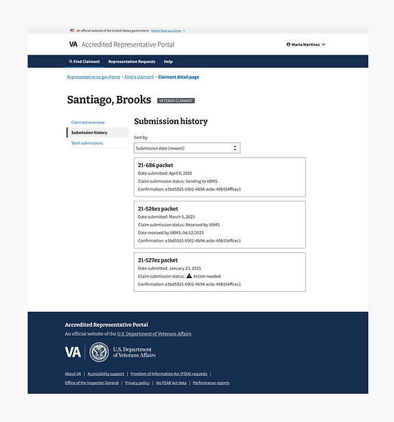
3 Tab Layout - Submission history tab

3 Tab Layout - Start submissions tab

Optional layout exploring a segmented tab approach (Claimant overview shown), and persistent action links on top

Optional layout exploring a segmented tab approach (Submission history shown), and persistent action links on top
Stage 3 - Converging on a Direction
The explorations converged on a 3-tab sidebar navigation approach. Separating Claimant Overview, Submit Claims, and Submission History into distinct tabs reduced cognitive load and gave each task its own clear space. POA details were refined based on confirmed data availability from VA systems, and the submission workflow was isolated into its own tab to keep the path from verification to action clean and future-ready.

3 tab layout, claimant overview tab

3 tab layout, submit forms tab

3 tab layout, submission history tab
Stage 4 - Finalizing the Submission Entry Point
The final design question was how representatives should begin a claim submission. We explored two directions: a coupled card that combined form download and "Start Claim" actions in one place, designed to scale as more forms were added over time; and a dedicated Submit Forms tab with direct access to the VA Find a Form tool and submission links in the header. Each approach had tradeoffs between simplicity and flexibility, which we brought into usability testing to validate.

Direction 1: A coupled card combining form download and "Start Claim" into a single entry point, designed to scale as more form types are added over time.

Direction 2: A dedicated Submit Forms tab with access to VA's Find a Form tool and submission links in the header, prioritizing flexibility for representatives with different submission preferences.
Stage 5 - Final Design for Testing
The 3-tab sidebar approach moved forward as the direction for usability testing. Alerts were placed intentionally to surface the most time-sensitive information without overwhelming the page. The Submit Forms tab was separated into its own dedicated workflow, enabling future integration with VA.gov's Find a Form tool and support for additional form types over time.
The submit flow was designed to support two paths from the start: form upload for standard submissions, and instant submission for ITF, with a framework that could accommodate additional form types as new VA APIs became available.
What We Tested & Why
With the converged design in place, we ran usability sessions with accredited representatives to validate whether the Claimant Page supported real-world task completion.
We focused on four areas:
-
Whether representatives could successfully find the right claimant using the search interface.
-
Whether critical information like POA status, VSO representation, and submission history was clear and actionable at a glance.
-
Whether the tabbed navigation felt intuitive and helped users move efficiently between sections.
-
And whether representatives could initiate and complete a claim submission confidently from the Claimant Page.
The goal was to confirm that our design decisions held up under real use before expanding functionality further.
Outcomes
Research findings translated directly into design changes before engineering handoff. POA terminology was renamed to match how representatives actually talk about their work. Navigation labels were updated to reduce misinterpretation. Critical alerts were elevated so time-sensitive actions couldn't be missed. Submit Forms was restructured into a dedicated workflow supporting multiple submission paths.
The MVP launched successfully. The foundation established, information architecture, tab structure, and submission workflows, was built to scale as additional VA data and APIs become available.

Claimant overview changes. Including alerts.

Submit forms changes. Including multiple paths to submission.
Reflection
The biggest lesson from this project was learning to design for what's real, not what's ideal. Data limitations at launch meant we couldn't build the full 360-degree view we envisioned, but designing a foundation that could grow turned out to be the more valuable skill.
Working this closely with engineers and getting to conduct research also reinforced something I want to carry forward: the best design decisions aren't made at your desk. They're made in the room with the people who actually use the product.